


I discovered design at twelve and found my passion in creating. When I was a kid, all I wanted was a cool-looking gaming channel on YouTube. I quickly learned that making my own profile picture and banner didn't just look nice—it made people stop and watch. I didn't just want to play games; I wanted to leave a mark.
What started as a hobby soon turned into a real obsession. I loved playing around with graphics and spent years creating logos, posters, and brand identities for startups. It was exciting to turn their messy ideas into designs that people trusted and recognized instantly. But over time, something shifted. I realized that a pretty brand is useless if the product itself doesn't work. I wanted to get to the root of the problem—building the actual tool instead of just dressing it up. That urge to solve real, everyday problems is what pulled me into product design, and it's where I belong today.
The products I want to work on are the ones where design isn't decoration — it's the reason the product works at all.
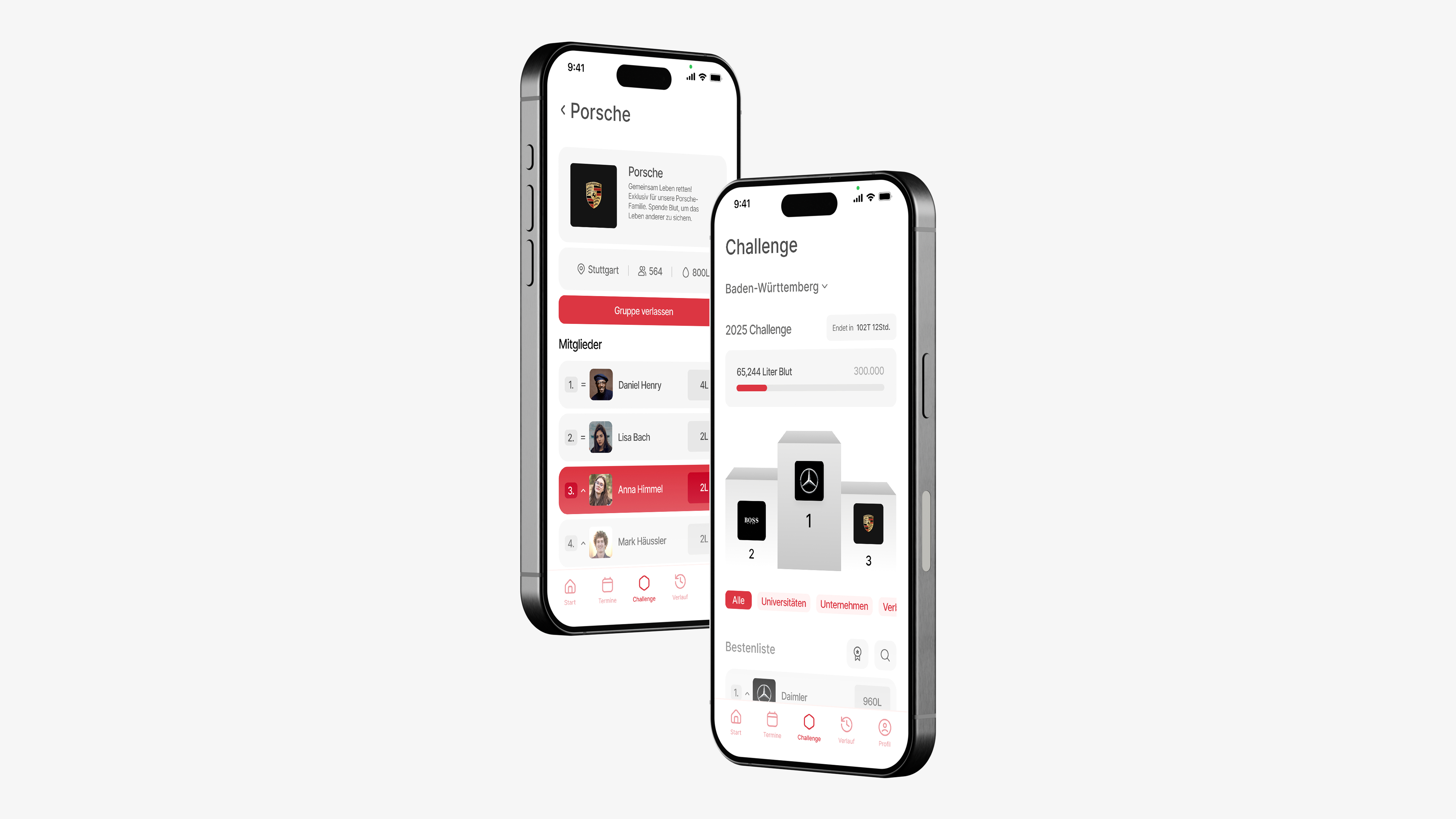
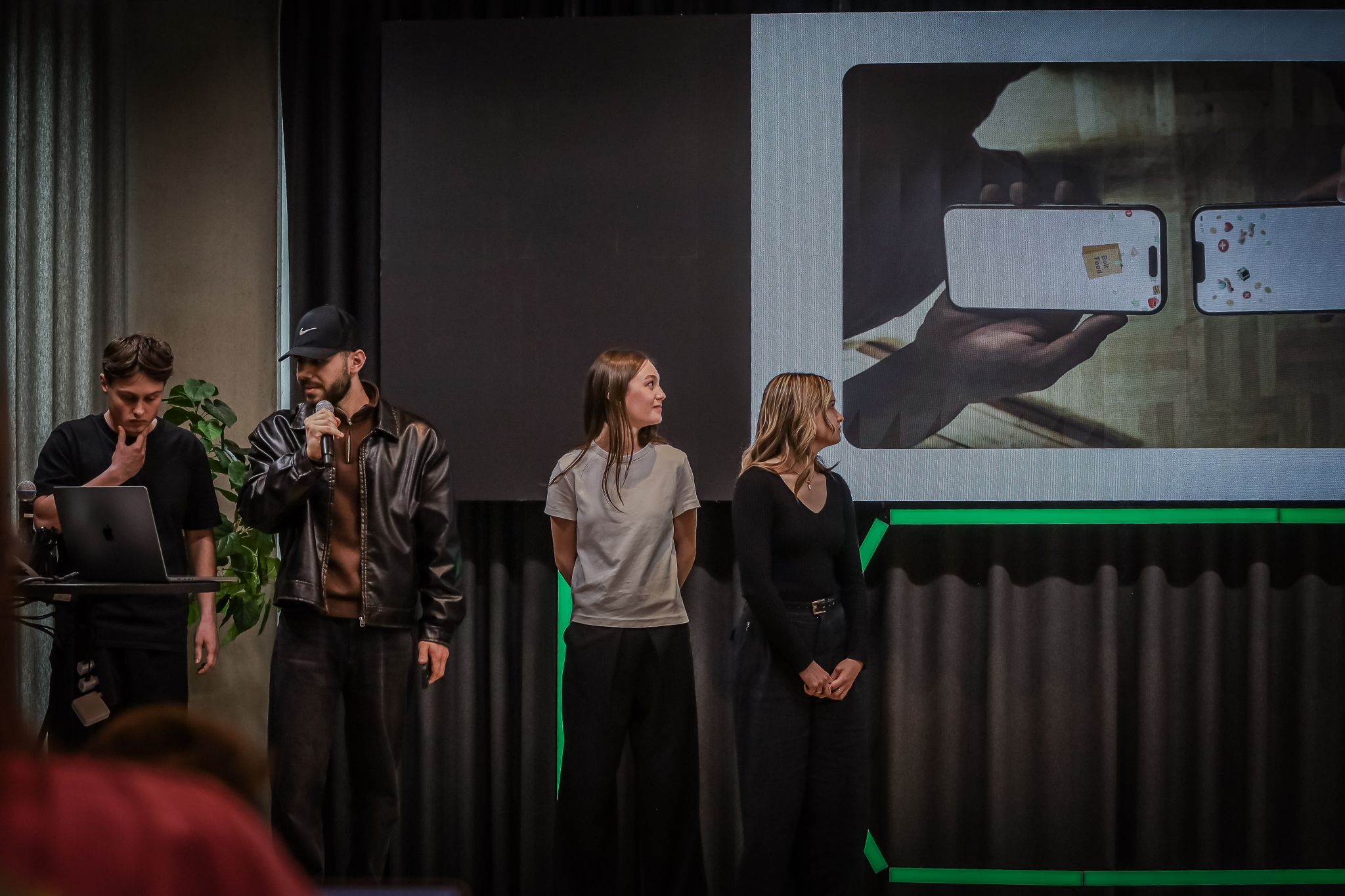
Five months in Tallinn across several studio projects — Emotional Design, Tangible Design, Design in the Changing World, and Design for Digital Innovation with Bolt. The Bolt brief took me into field research and the last meters of delivery; the wider semester pushed me toward service design that respects everyone in the triangle, not just the screen.
End of my Tallinn semester — volunteered at Latitude59, the Baltics' flagship startup and tech conference. An intense few days behind the scenes while the city turned into a meeting point for founders and investors from dozens of countries.
Six months inside a global telco design org — my first time seeing scale, governance, and how slowly big systems move. I left with a clearer sense of what I want from tools (AI that designers can actually trust) and what “accessible by default” should mean in practice.
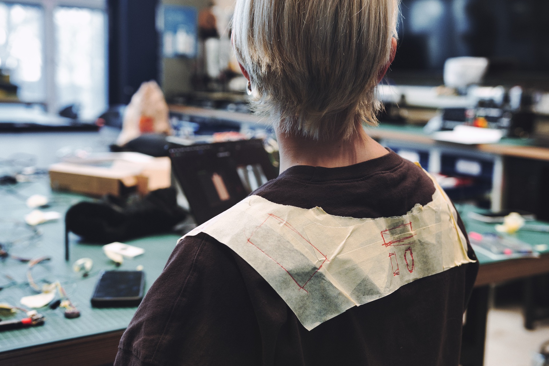
This is where product design became my main language — studio critiques, messy prototypes, and projects like Pulse and Aidea that still define how I work. HfG taught me to argue for decisions, not just present pretty frames.
A short, intense sprint — translating a complex AI product into something legible on a landing page. I liked the pace and the trust to own UI end to end, even when the domain was still half-defined.
Winter term at the lab — designing around models that change every week. It was exciting and slightly chaotic: you ship UI while the underlying capability is still moving under your feet.
A small agency rhythm — fast feedback, marketing pressure, and learning when to simplify a story for people who will only scroll once. Good training for crisp hierarchy and handoff discipline.
My first product team at scale — components, research, and shipping features millions of fans might touch. I learned how much alignment matters when marketing, editorial, and dev all pull in different directions.
Parallel to Sport1 — a slower, print-first mindset. Layout and type rhythm reminded me why spacing and hierarchy in apps are not so different from magazines, just faster to break.
Teaching forced me to name things I had only done intuitively — constraints, components, workflow. Explaining Figma to first-years made my own process more deliberate.
Years of freelance brand and web work — logos, identities, and sites for startups who needed to look credible overnight. It built my craft, and it also showed me why I eventually moved toward products, not just packaging.

