Reach App Cover

Reach

Stay truly connected with the people who matter most. Easily keep in touch, track your calls, and nurture real relationships in a world full of digital noise.

Year

2024

Role

UX Design

UI Design

Prototyping

Motion Design

Tools

Figma

After Effects

Notion

Overview

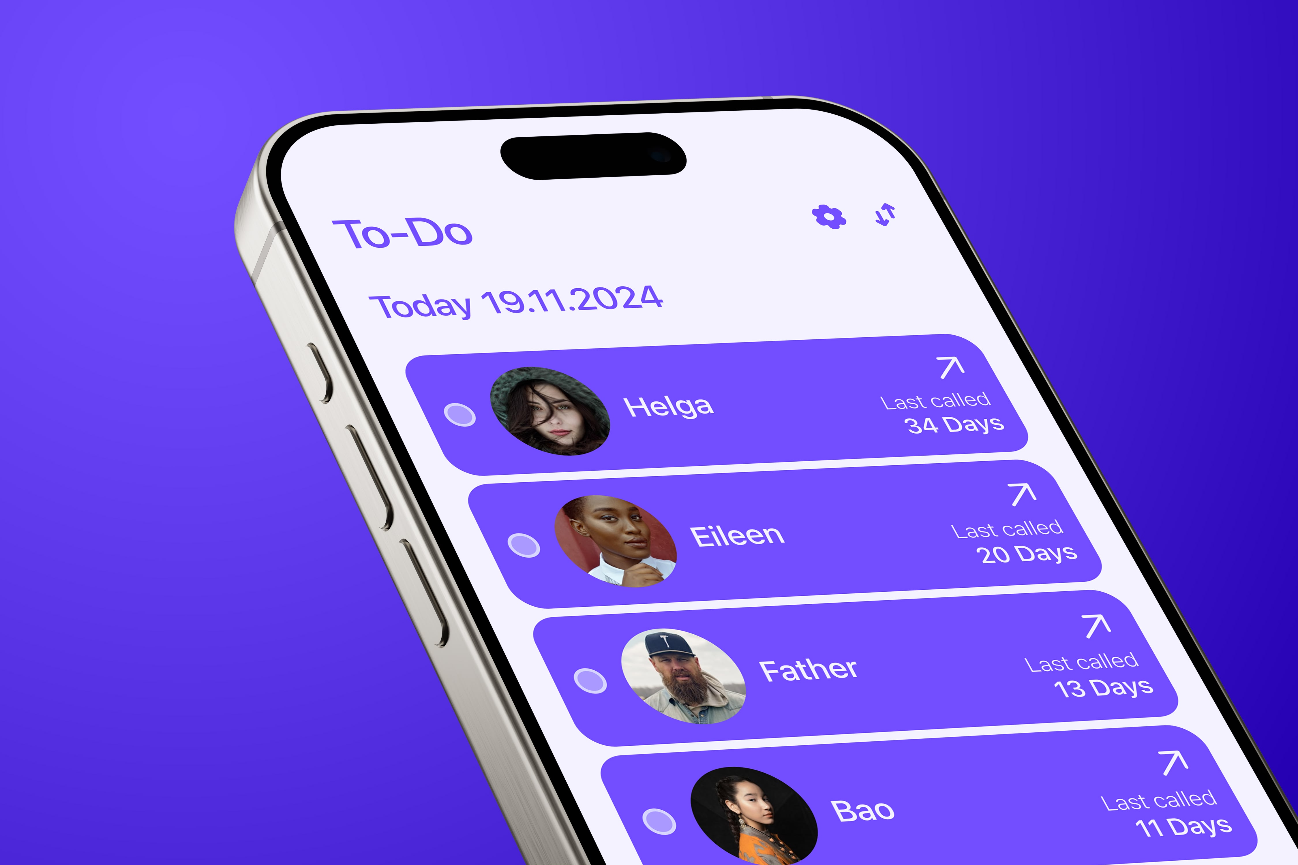
Imagine an app designed to help you stay in touch with the people you love. Instead of just scrolling through a giant list of names, you'd focus on those you truly want to call regularly - maybe your closest friends, parents, siblings, or that old mentor you keep meaning to catch up with.

After each call, you'd mark it off as "done," just like crossing a task off your to-do list. By the end of the week, month, or even the year, you'd see how often you've connected with your loved ones. It's a way to stay accountable, make those personal moments count, and never feel out of touch.

Try it yourself

๐Ÿ‘จโ€๐Ÿ’ผ

Dad

Last called: 3 days ago

๐Ÿ‘ฉโ€๐ŸŽ“

Sarah (Best Friend)

Last called: 1 week ago

๐Ÿ‘จโ€๐Ÿซ

Prof. Miller (Mentor)

Last called: 2 months ago

This Week's Progress

0 of 3 calls made this week
Concept

In today's hyper-connected world, we're constantly bombarded with notifications, messages, and digital noise. Despite being more "connected" than ever, many people report feeling increasingly disconnected from their closest relationships.

Reach was designed to address this paradox by helping users intentionally nurture their most important relationships through a focused, mindful approach to staying in touch.

The Problem Reach Solves

โŒ Traditional Way

๐Ÿ“ฑ Instagram (99+)
๐Ÿ’ฌ WhatsApp (47 unread)
๐Ÿ“ง Email (156 unread)
๐Ÿฆ Twitter (23 mentions)
๐Ÿ“บ YouTube (12 updates)
๐Ÿ’ผ LinkedIn (8 messages)

Overwhelming digital noise makes it easy to lose track of what matters

โœ… The Right Way

๐Ÿ‘จโ€๐Ÿ‘ฉโ€๐Ÿ‘งโ€๐Ÿ‘ฆFamilyWeekly calls
๐Ÿ‘ฅClose FriendsBi-weekly check-ins
๐ŸŽ“MentorsMonthly updates

Focus only on relationships that truly matter to you

Visual Language

The look and feel of Reach is all about clarity, warmth, and authenticity. Soft colors, friendly shapes, and clean layouts make it easy to focus on what mattersโ€”your relationships. The Project Left Navigation helps you find your way intuitively and keeps everything organized, so you always feel at home.

Typography Animation

Color System Animation

Color System Animation

User Interface

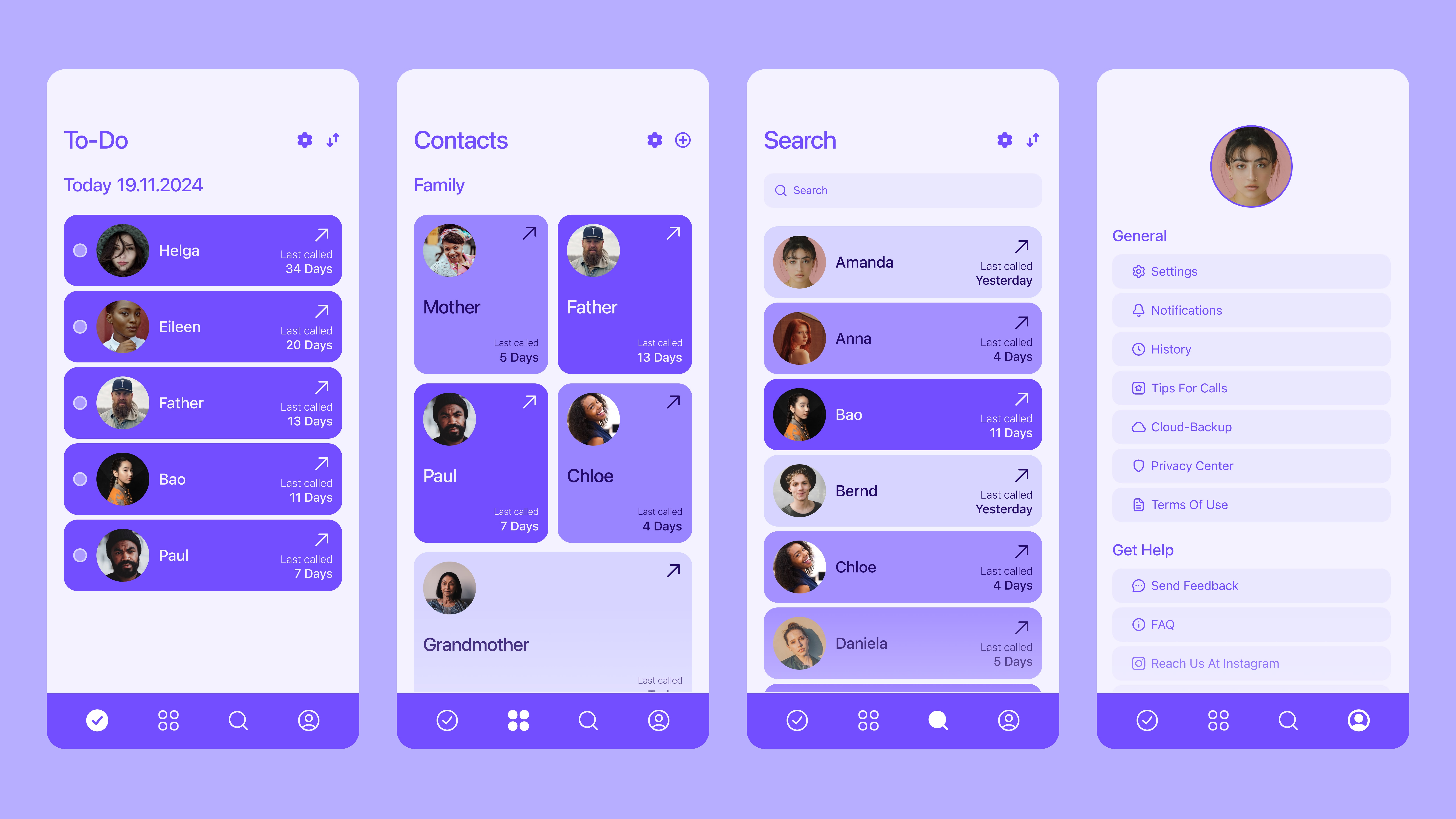
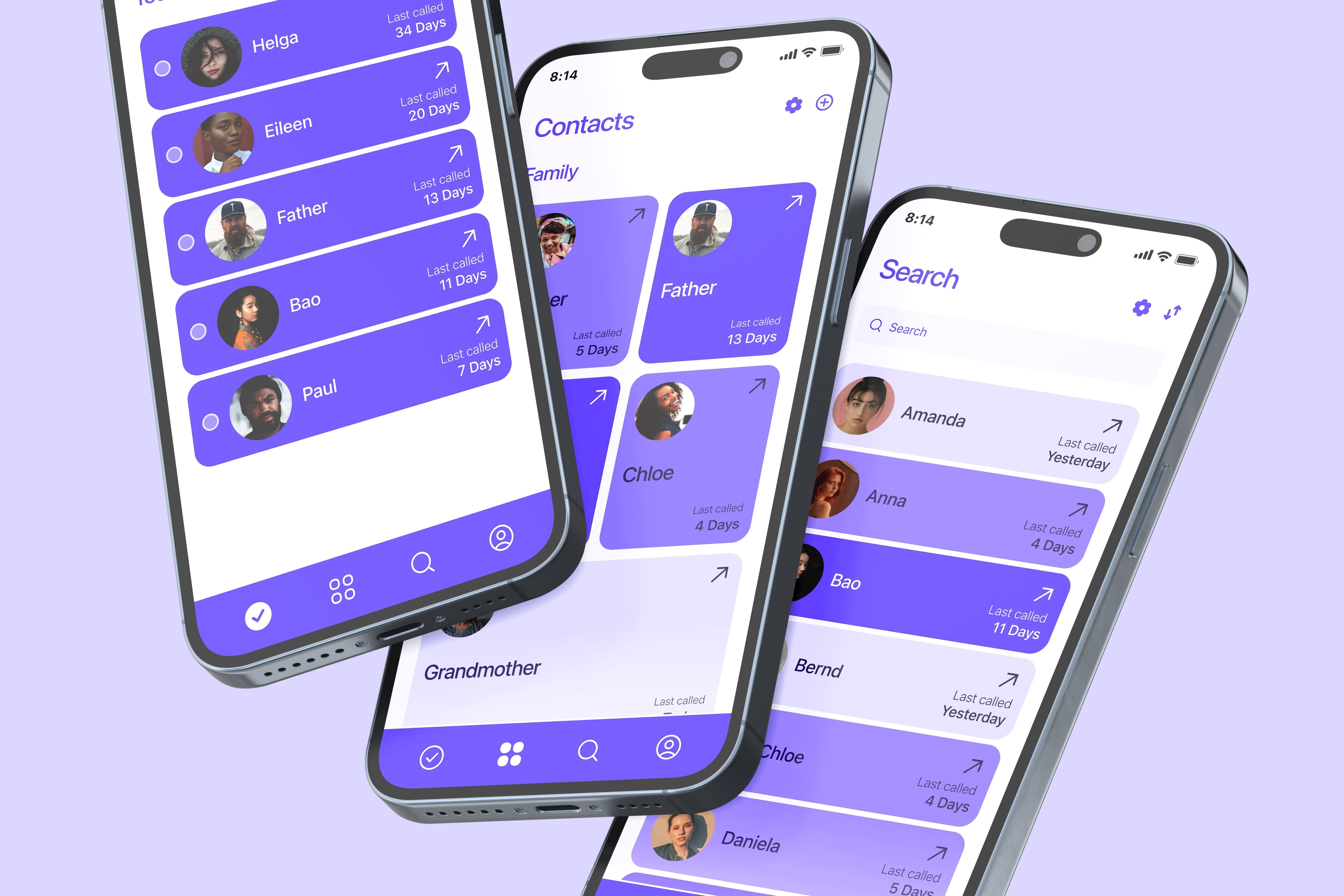
Everything in the interface is made to be simple and welcoming. You always see whatโ€™s important, find contacts quickly, and feel at home thanks to the Project Left Navigation. Friendly colors and clear layouts help you focus on your relationships, not on searching for features.

Reach User Interface Overview

Contact Management

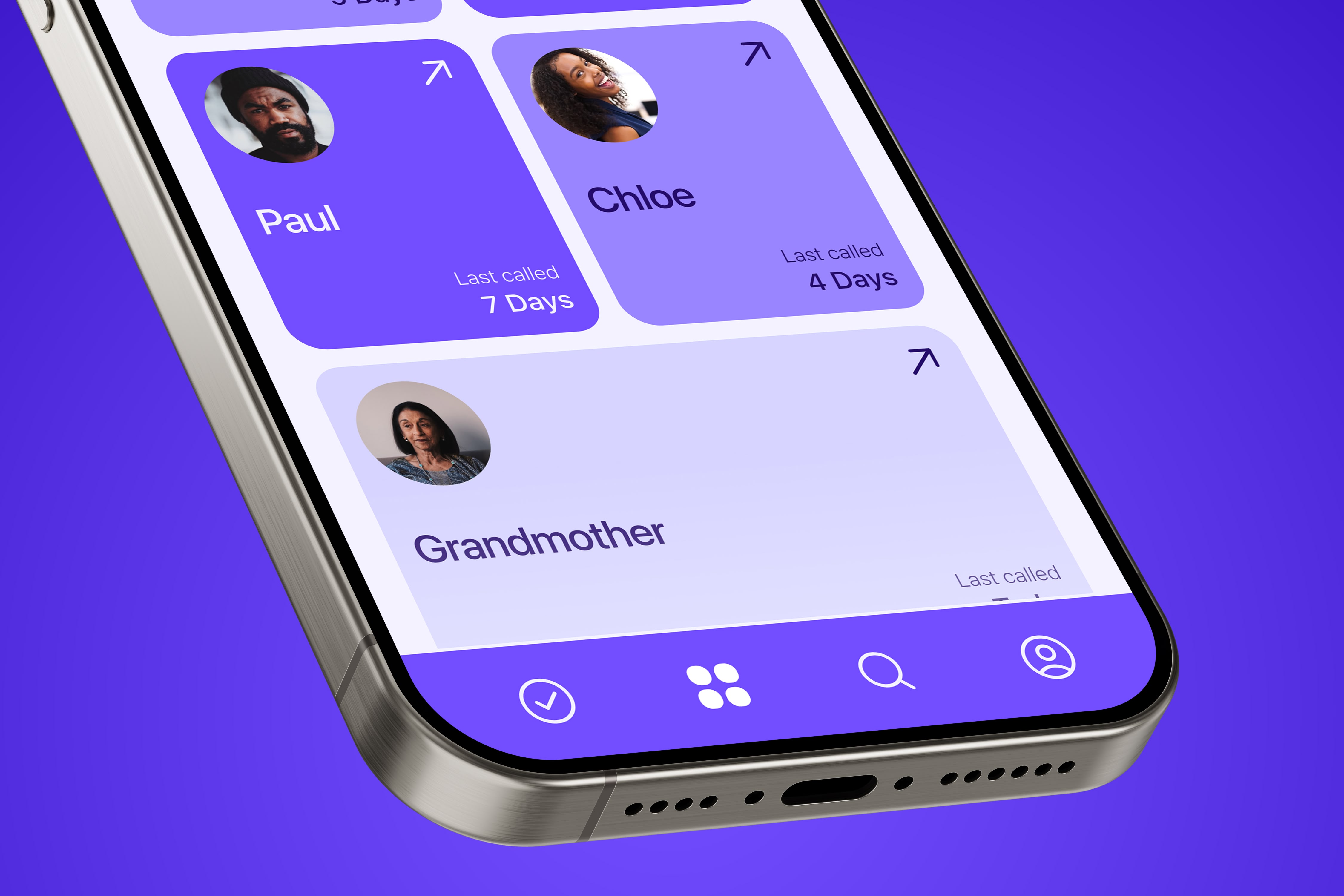
You always know who matters most and never lose touch. Your most important people are always visible, so you can stay close and connected.

The app reminds you when you last called and helps you keep relationships strongโ€”without stress or forgetting anyone.

Contact Management Interface

Snapshots

Reach App Mockup 1
Reach App Mockup 2
Reach App Icon

Conclusion

Designing Reach taught me that the most meaningful digital experiences often come from intentional constraints rather than endless features. By focusing on the core human need for genuine connection, we created an app that doesn't compete for attention but rather helps people be more present in their relationships. The challenge wasn't building another communication platformโ€”it was designing a tool that encourages users to step away from their screens and actually call the people they care about. In a world full of digital noise, sometimes the best technology is the one that helps us return to what truly matters: real conversations with real people.

More Projects