A thoughtfully designed app to help you stay connected with the people who matter most.
Imagine an app designed to help you stay in touch with the people you love. Instead of just scrolling through a giant list of names, you'd focus on those you truly want to call regularly - maybe your closest friends, parents, siblings, or that old mentor you keep meaning to catch up with.
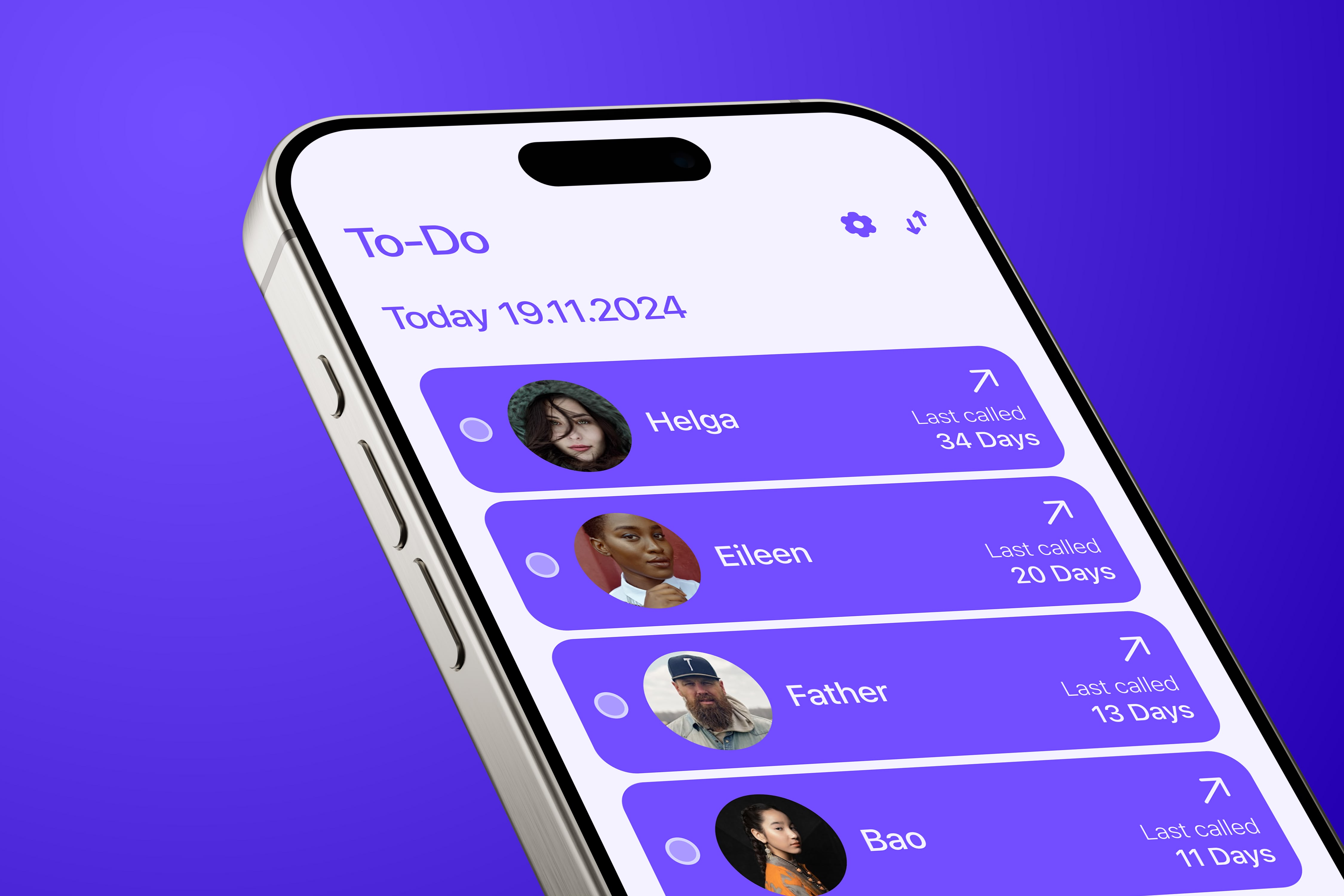
After each call, you'd mark it off as "done," just like crossing a task off your to- do list. By the end of the week, month, or even the year, you'd see how often you've connected with your loved ones. It's a way to stay accountable, make those personal moments count, and never feel out of touch.
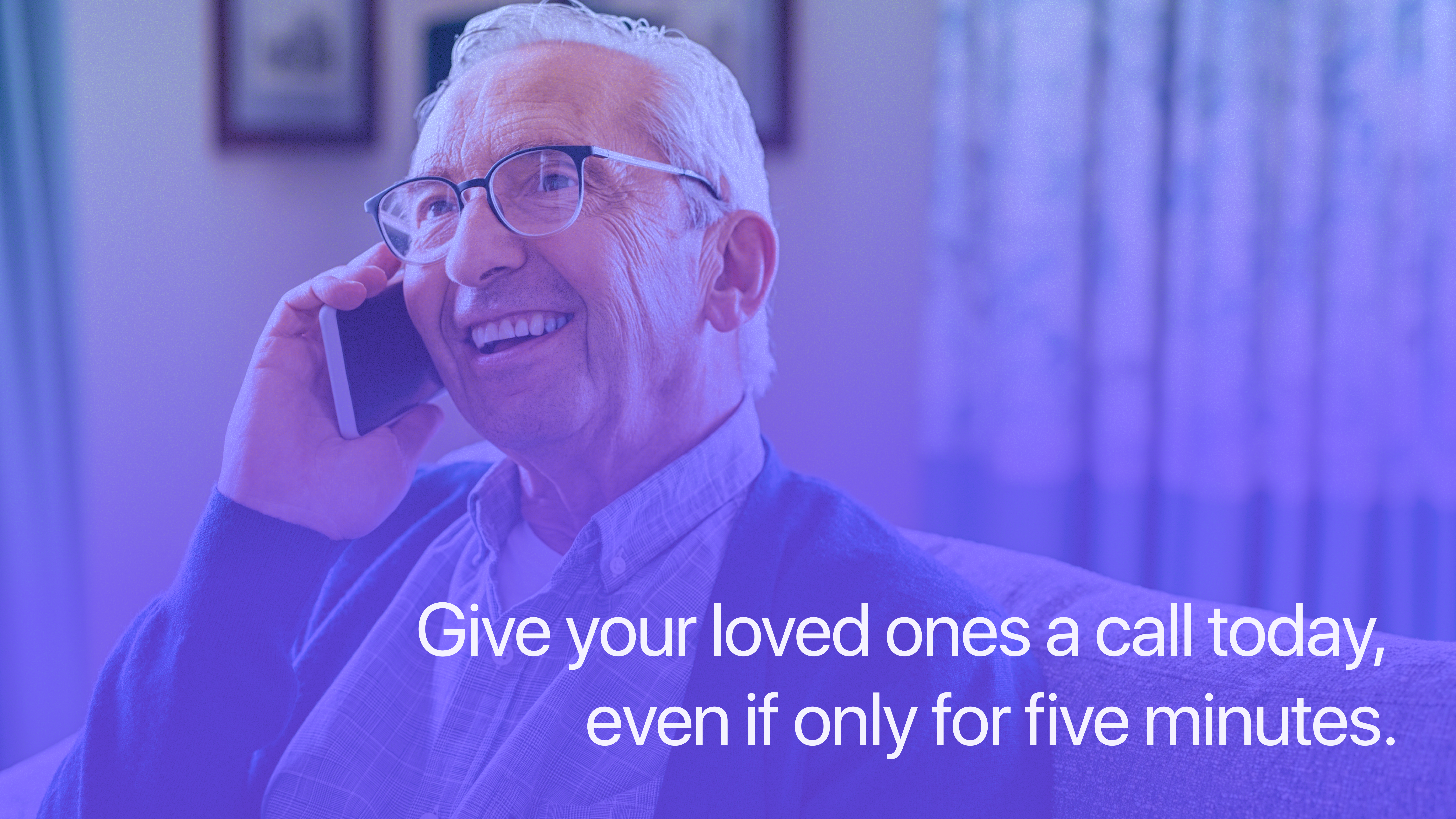
In today's hyper-connected world, we're constantly bombarded with notifications, messages, and digital noise. Despite being more "connected" than ever, many people report feeling increasingly disconnected from their closest relationships.
Reach was designed to address this paradox by helping users intentionally nurture their most important relationships through a focused, mindful approach to staying in touch.

The brand identity for Reach needed to convey warmth, connection, and intentionality. We developed a visual language that feels personal and intimate while maintaining a clean, modern aesthetic that appeals to our target demographic.
Typography Animation
Color System Animation
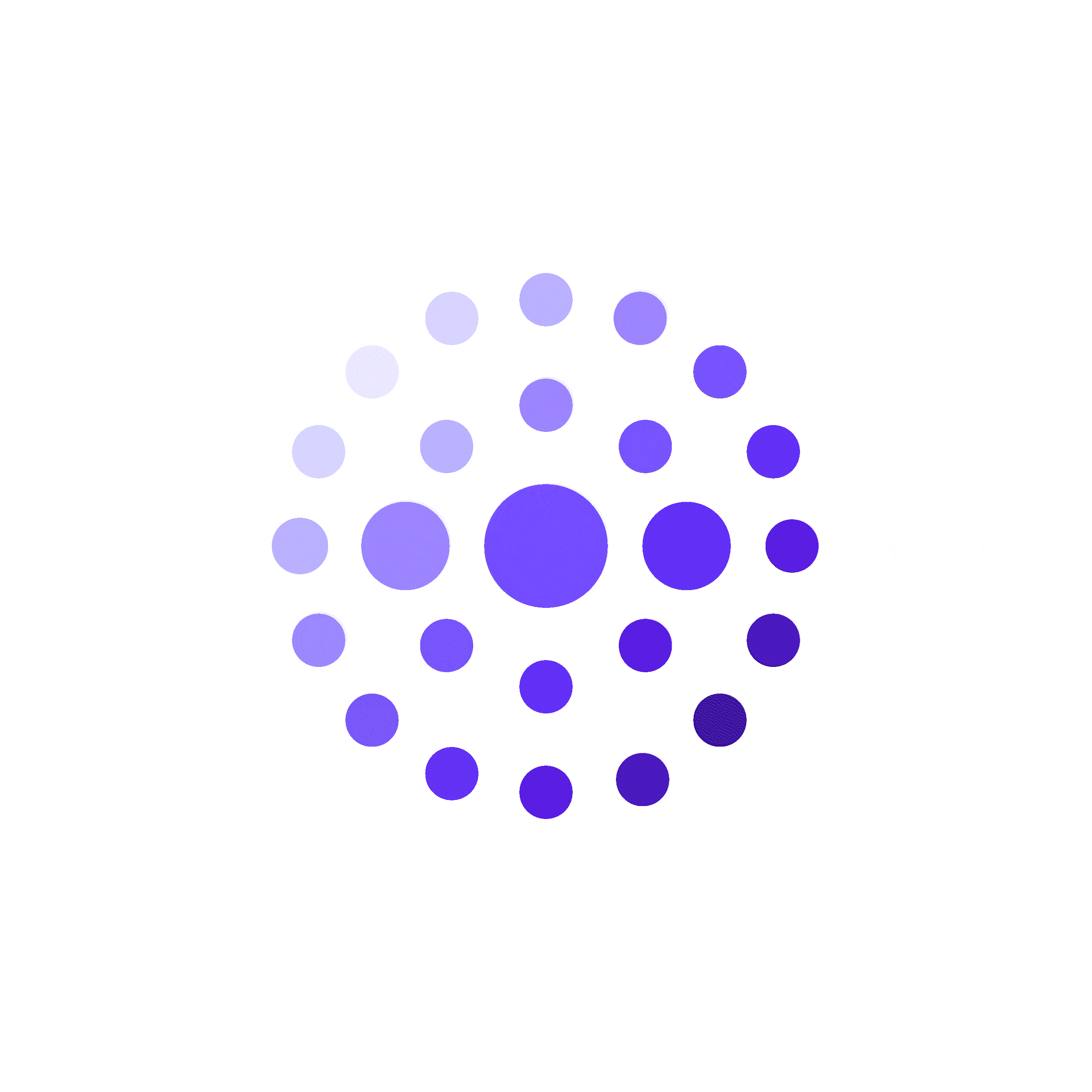
Our color system is built around a rich purple spectrum that creates a sense of trust and creativity. The primary colors range from deep violet to soft lavender, providing depth and flexibility throughout the interface.
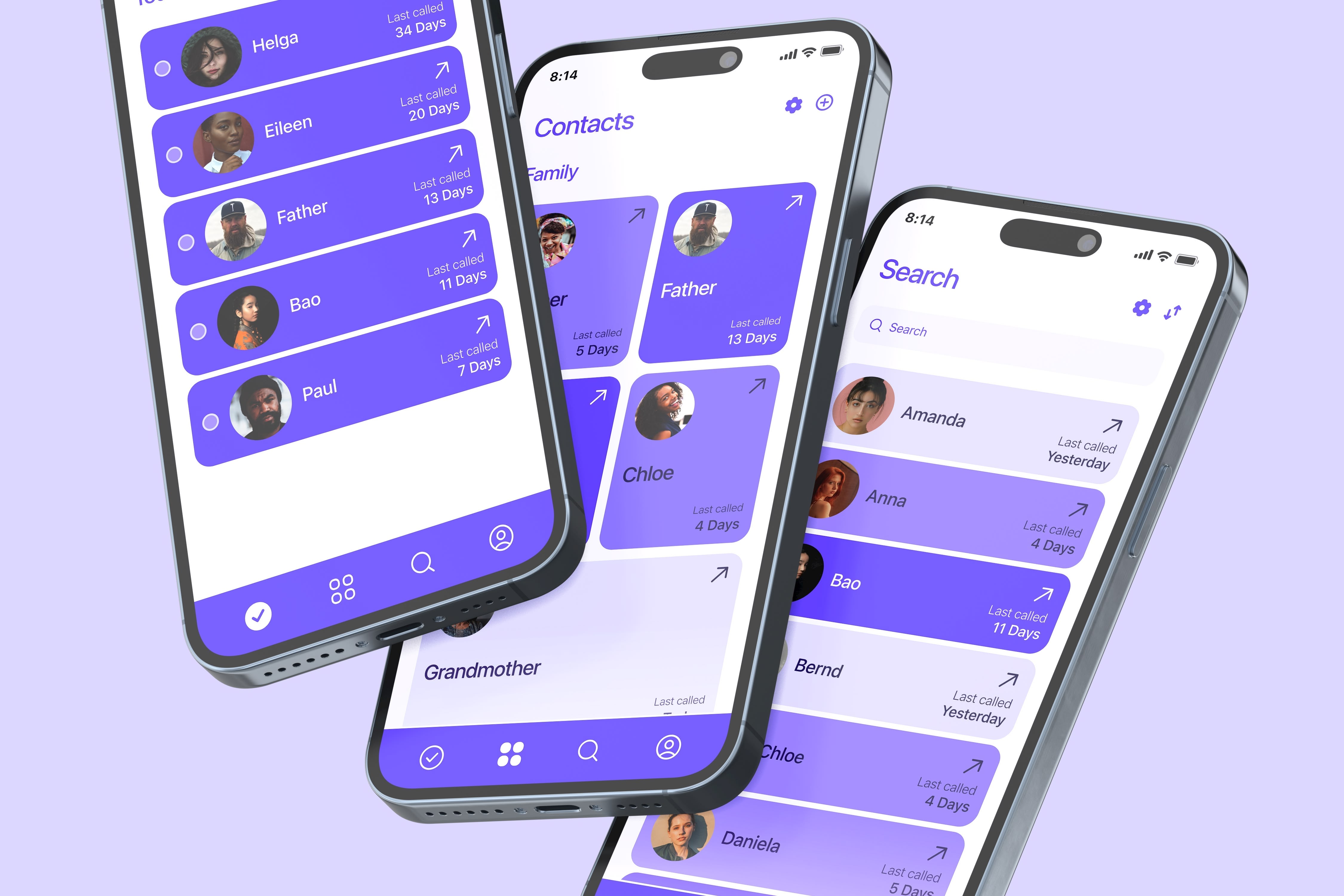
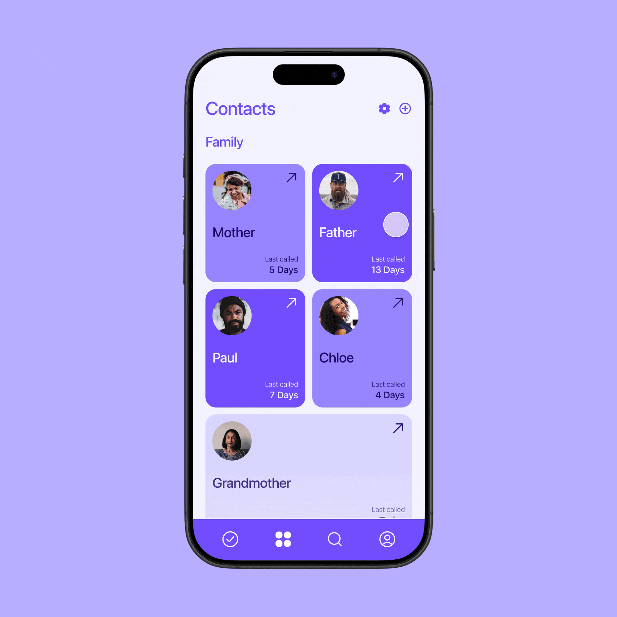
The UI design for Reach balances warmth and clarity, with a focus on making relationship management intuitive and visually appealing. The interface uses clean layouts, clear typography, and strategic use of color to guide users through their relationships.
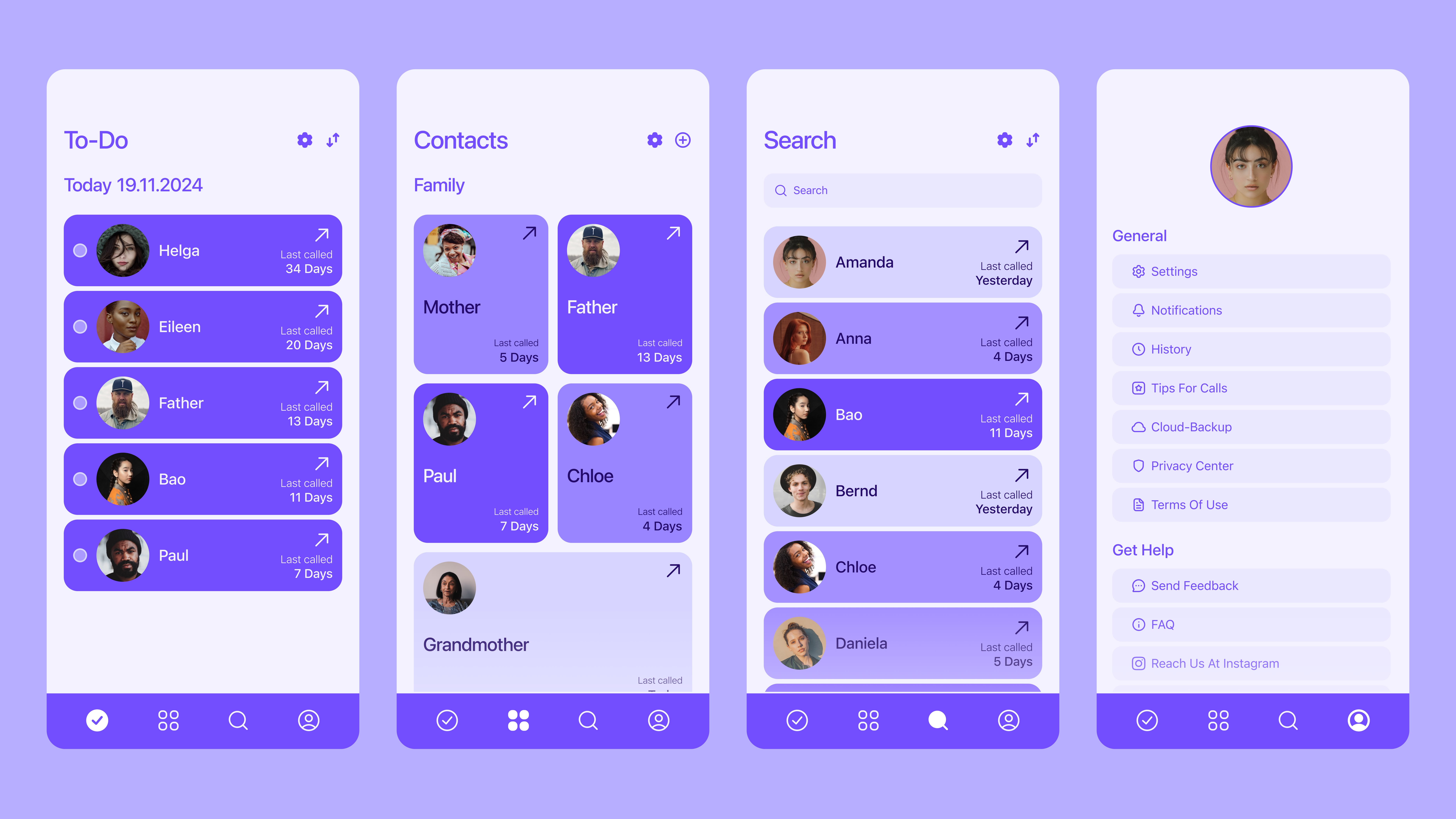
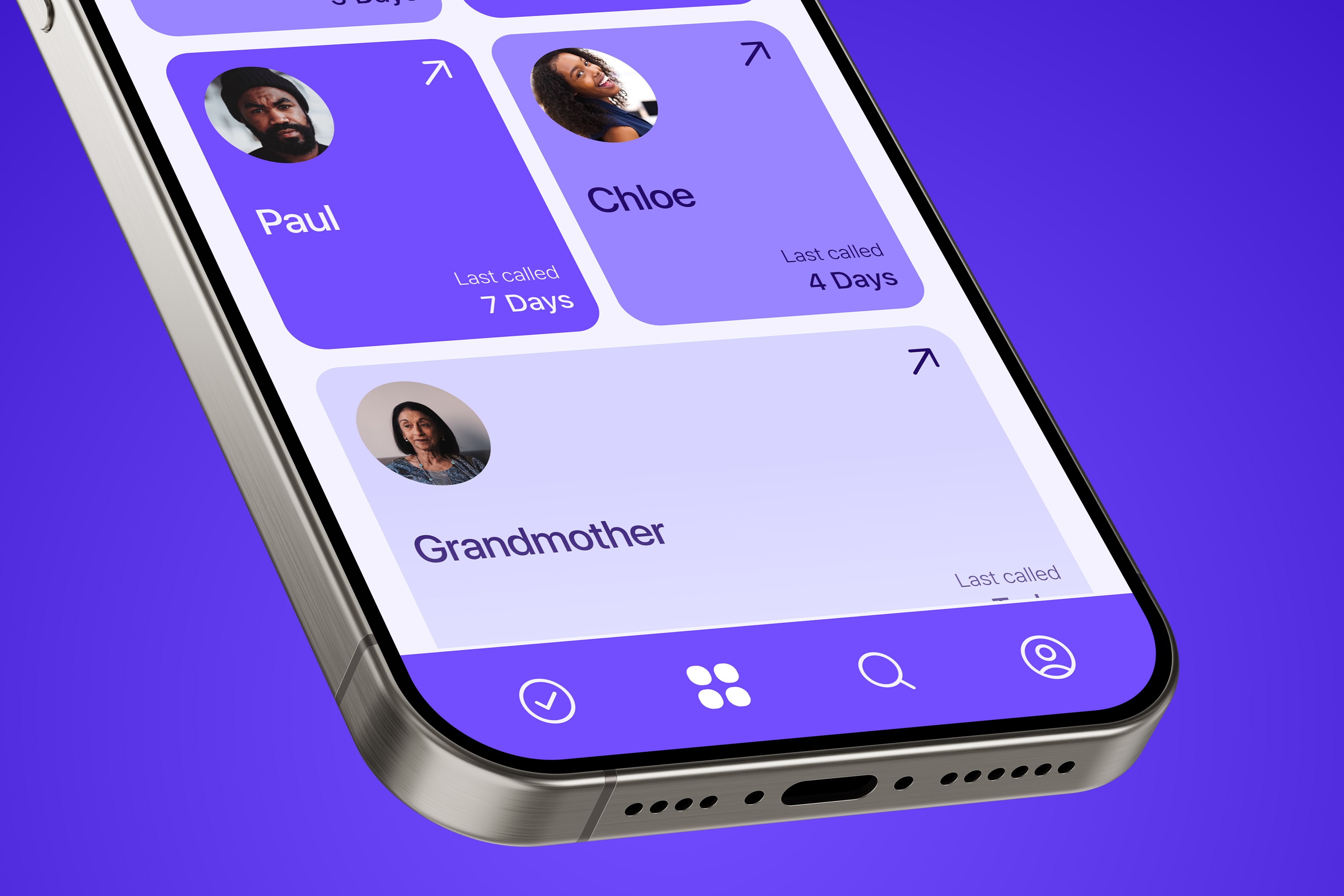
The contact management screen allows users to view and organize their closest connections. Each contact card displays the person's photo, name, and when they were last contacted.
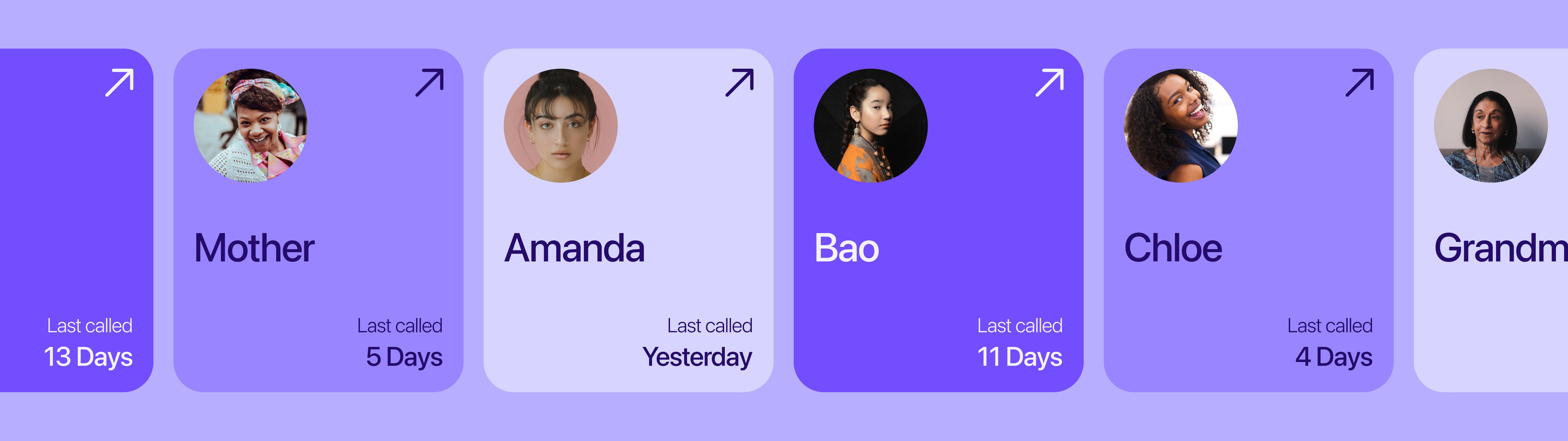
Focus on the people who matter most to you, rather than managing a large contact list.
Set personalized connection goals for each contact - weekly, monthly, or quarterly.
Mark calls as complete and track your consistency over time.
Visualize your communication patterns and see your progress.
Receive timely, non-intrusive notifications when it's time to reach out.
Keep track of important life events or topics to follow up on next time.
Scheduling and making calls with your priority contacts
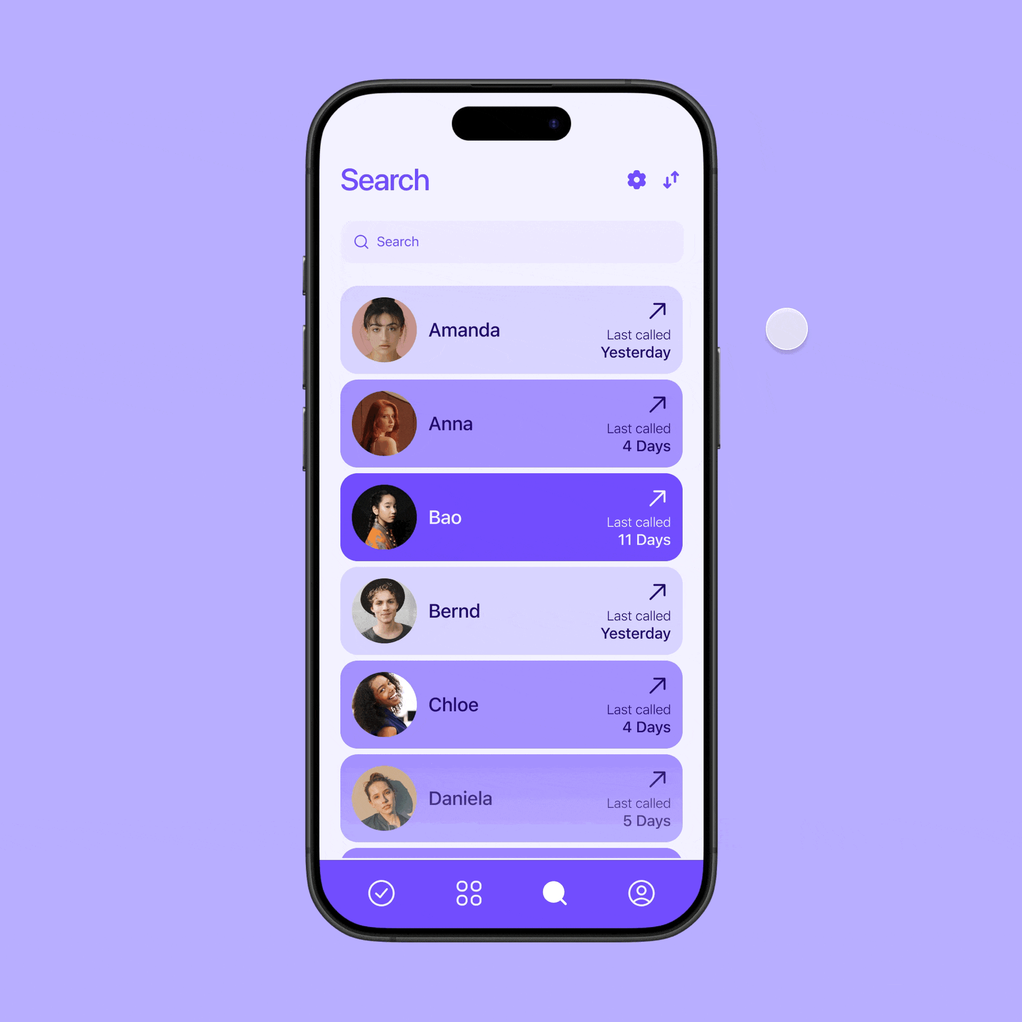
Quickly finding and filtering your important connections
Reach helps you prioritize relationships and maintain meaningful connections through intentional communication.
The app's simple interface makes it easy to see who you need to reach out to and when.
Mark it off once you connect. Just like a to-do list.
People seek deeper existing relationships rather than expanding networks. Design that helps users focus on what matters most resonates deeply.
In an era of notification fatigue, users respond positively to respectful, non-intrusive reminders and prompts.
Providing users with visual representations of their relationship networks helps them make more intentional connection choices.
Modern relationships exist across multiple communication channels, and successful relationship tools need to integrate with this reality.
An innovative blood donation app that motivates young people to donate regularly.
A comprehensive rebrand for a digital marketing agency focused on precision targeting.
A smart watch concept with focus on essential features and minimal distractions.