A social media marketing agency focusing on defining the target customer group of businesses.
ReTarget is a company that helps businesses and organizations manage their social media presence. Through the creation and management of social media accounts, as well as the development and implementation of social media strategies, they promise to reach thousands of prospects on various social media platforms such as Facebook, Instagram, Twitter, LinkedIn and Pinterest.
The goal of this project is to position ReTarget as a trusted and reliable social media management partner for businesses and organizations, by showcasing the company's expertise in creating and implementing social media strategies, and highlighting the success stories of clients who have achieved increased engagement and growth on various social media platforms.
Through the presentation, I aim to establish ReTarget as the go-to solution for businesses and organizations looking to improve their social media presence and reach their target audience effectively. The branding reflects the company's core values of precision, reliability, and innovation in social media marketing.

The brand identity for ReTarget needed to convey professionalism, precision, and reliability. We developed a visual language that communicates expertise in social media marketing while maintaining an approachable aesthetic that appeals to businesses of all sizes.
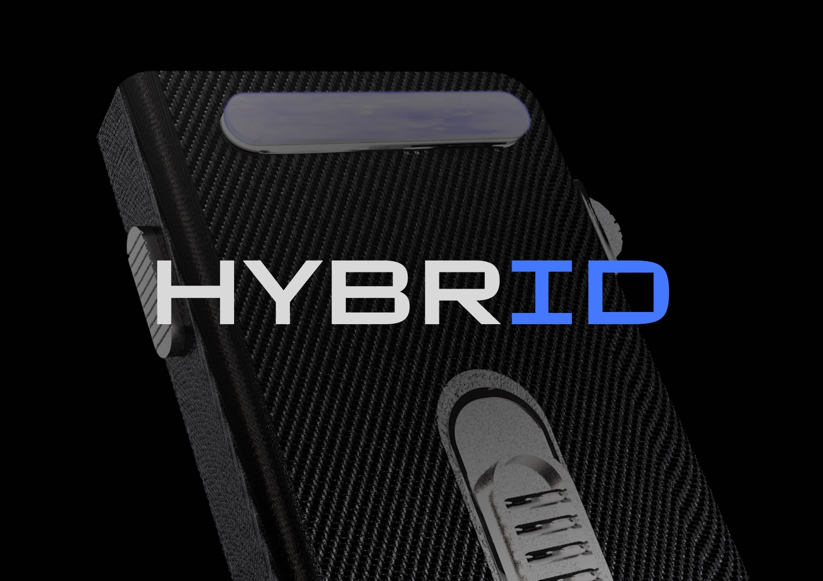
ReTarget's brand identity utilizes Geist Sans as its primary typeface. This modern, clean sans-serif font perfectly complements the brand's precision-focused messaging with its geometric structure and excellent readability across digital and print applications. The typeface's balanced proportions and subtle rounded details create a professional yet approachable impression that resonates with ReTarget's target audience of business professionals seeking social media expertise.
The color system is built around a professional blue palette that conveys trust, reliability, and innovation. The primary colors create a cohesive visual identity that stands out while maintaining a professional appearance.
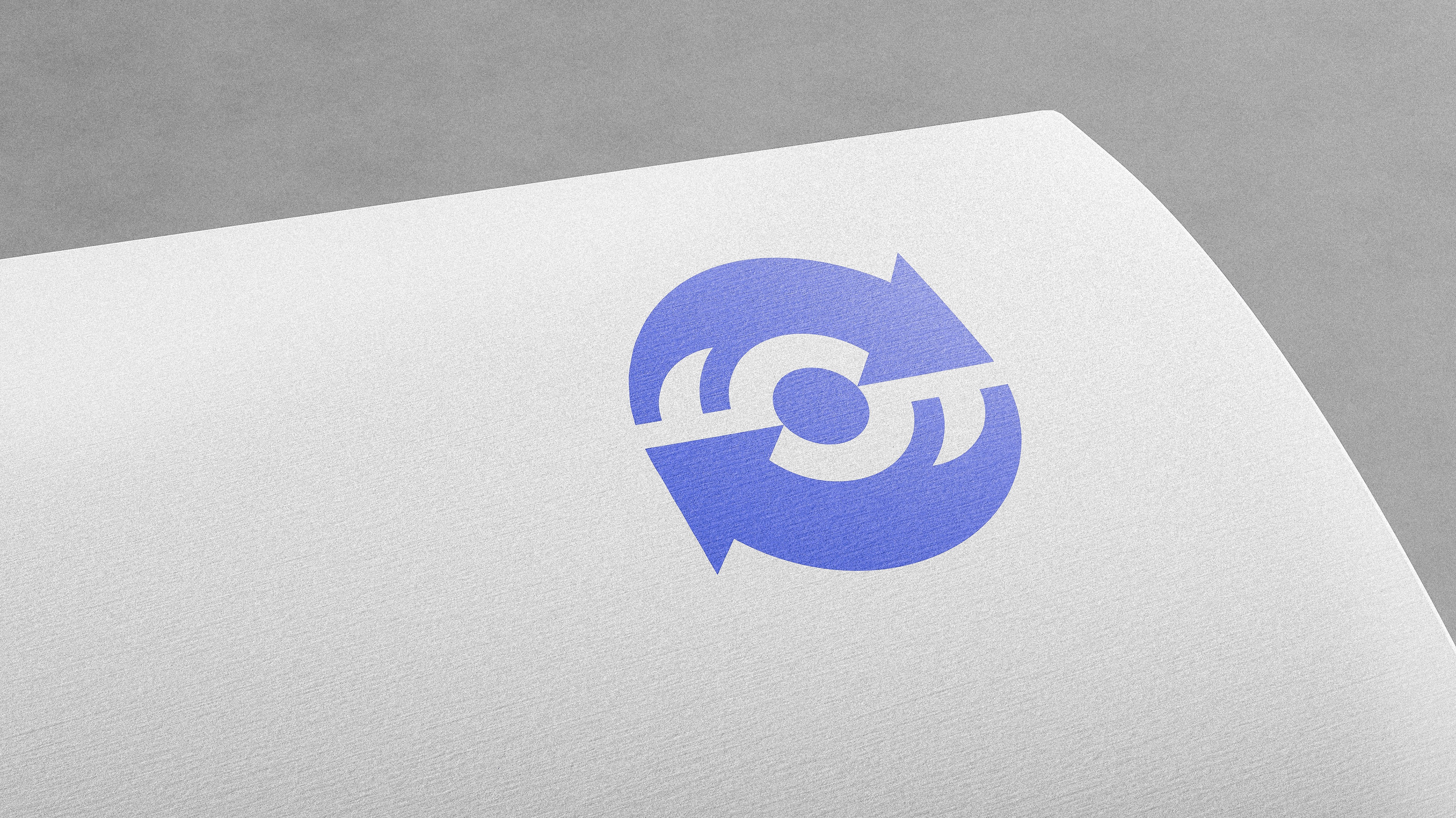
The ReTarget logo was designed to convey the brand's core values of innovation, efficiency, and reliability. The logo features a stylized target icon with arrows that represent repetition or change, highlighting the brand's commitment to refining social media management strategies to achieve the best possible results for businesses and organizations.
The combination of shapes creates a dynamic and visually appealing logo that is easily recognizable and memorable. The use of blue shades conveys a sense of professionalism and trust, while the arrow shape implies movement and progress.
Additionally, the target icon can be interpreted as a dartboard, representing the goal of identifying the right target audience for the brand. By utilizing ReTarget's social media management solutions, businesses can aim their message with precision, ensuring that they reach their intended audience and achieve their desired outcomes.
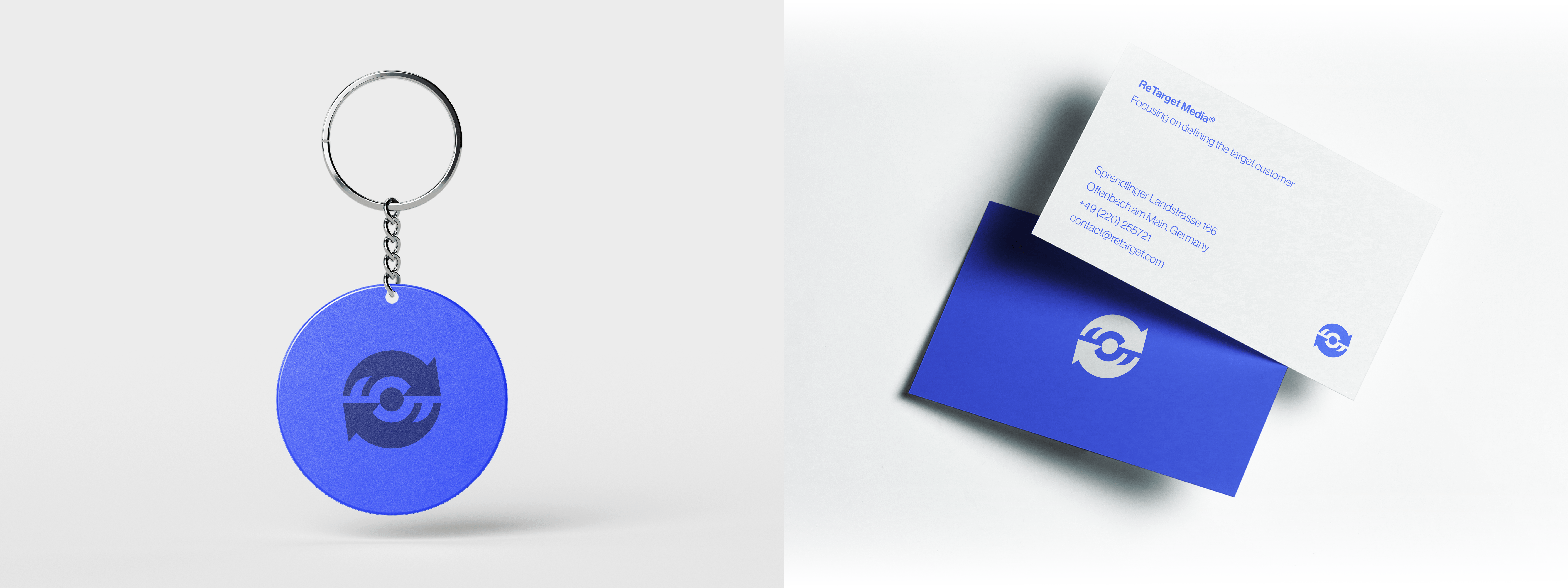
The ReTarget brand identity has been applied across various touchpoints to ensure a cohesive and recognizable presence in both digital and physical environments.
The ReTarget brand identity successfully positions the company as a trusted partner in social media marketing. The visual elements combine to create a cohesive brand that communicates precision, reliability, and expertise in reaching target audiences.
By focusing on the core values of precision, innovation, and efficiency, the ReTarget brand identity creates a professional yet approachable impression that resonates with businesses seeking to enhance their social media presence.
The brand identity developed for ReTarget perfectly captures our mission of helping businesses connect with their target audiences. The clean, professional design has dramatically improved our market presence and client perception.
The visual identity emphasizes the company's focus on precisely targeting the right audience for each client, making this core value immediately recognizable in all brand touchpoints.
The brand system works effectively across various touchpoints, from digital platforms to print materials, maintaining consistency while adapting to different contexts.
The target symbol creates an instantly recognizable visual shorthand for the brand, ensuring it stands out in the competitive social media marketing landscape.
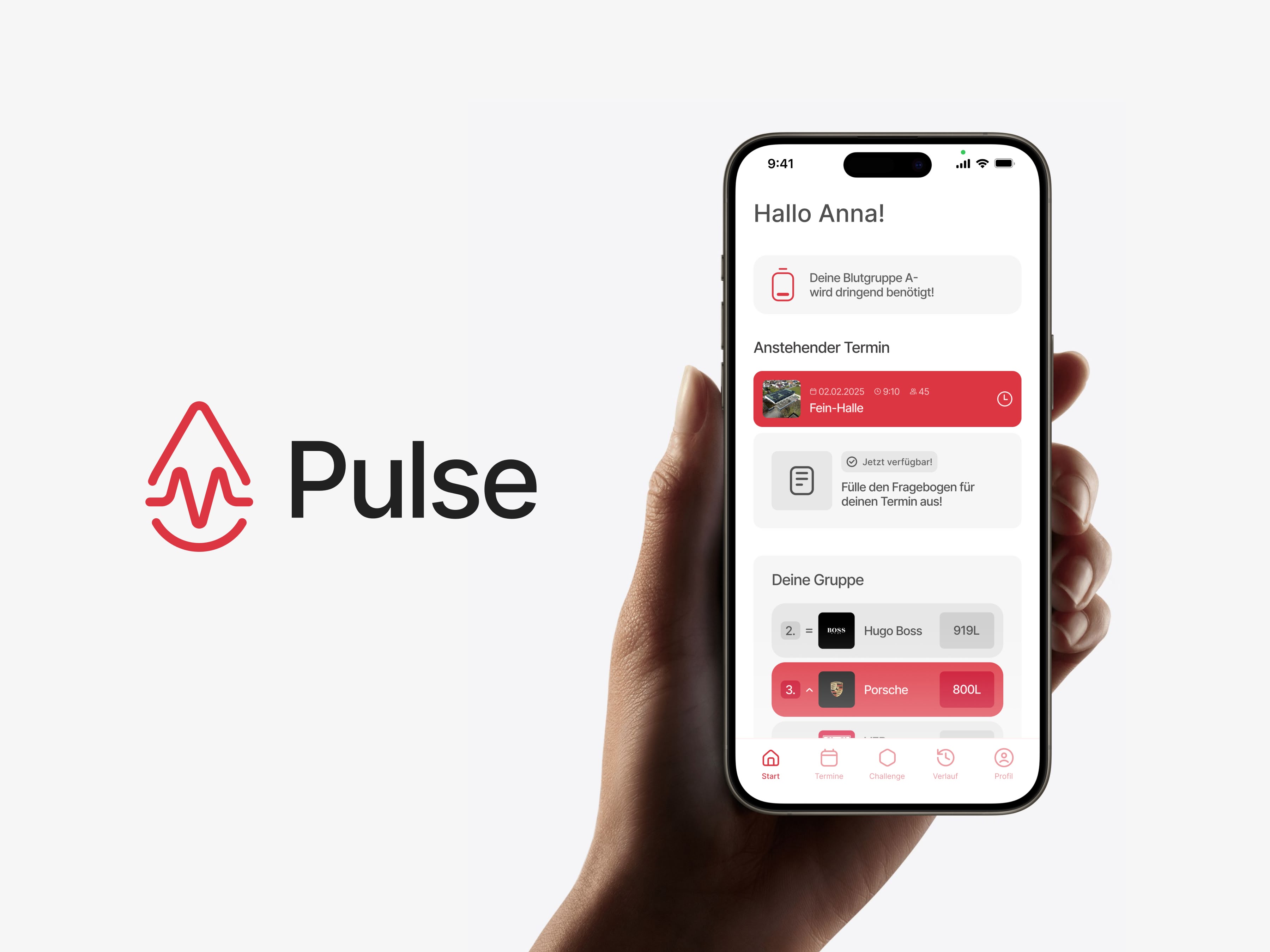
An innovative blood donation app that motivates young people to donate regularly.
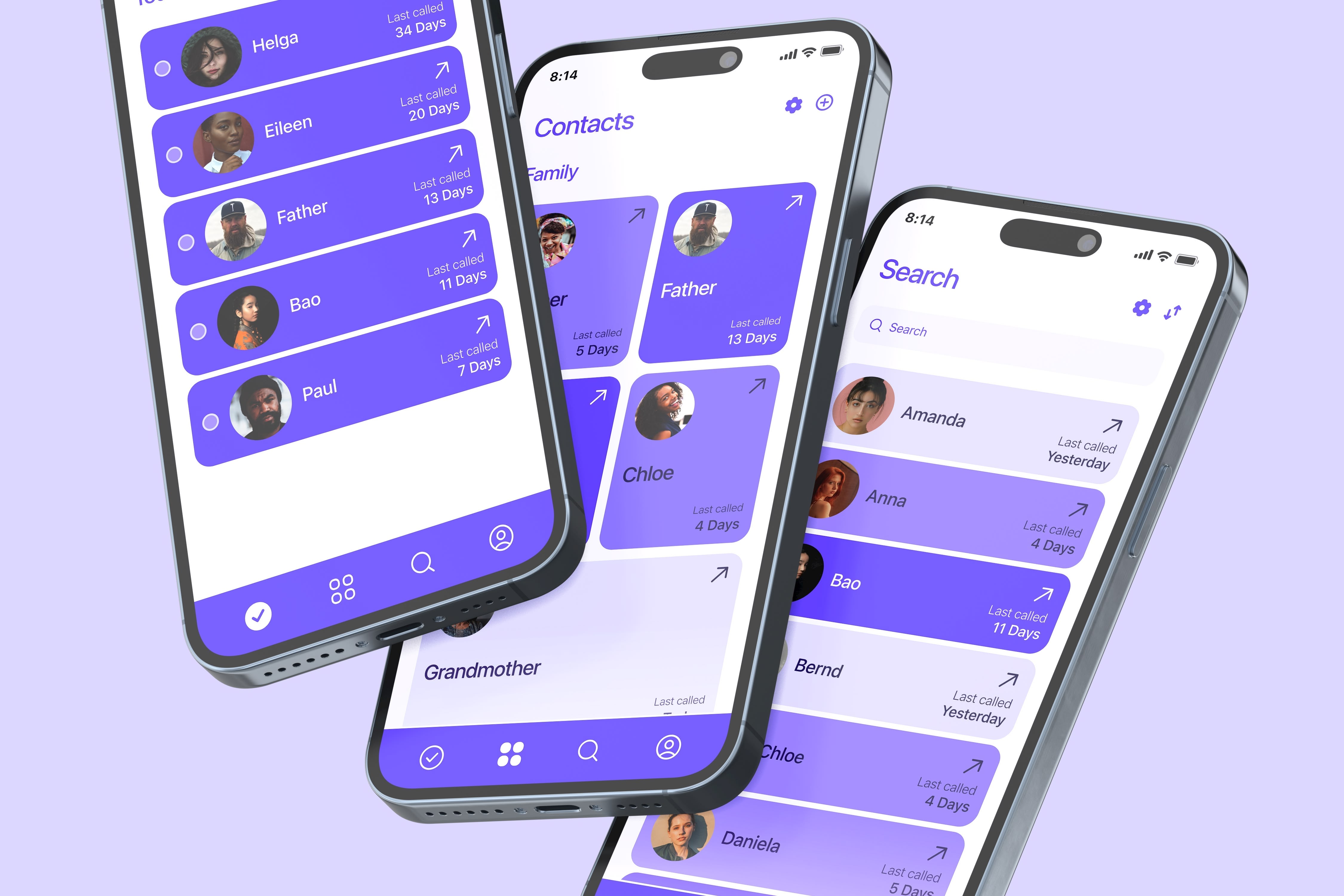
A social connection app that helps you stay in touch with people who matter most.
A smart watch concept with focus on essential features and minimal distractions.